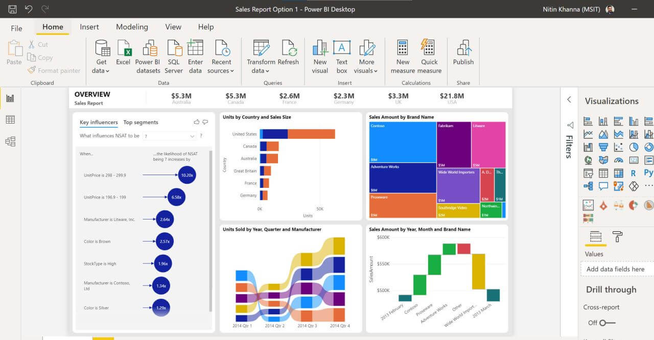
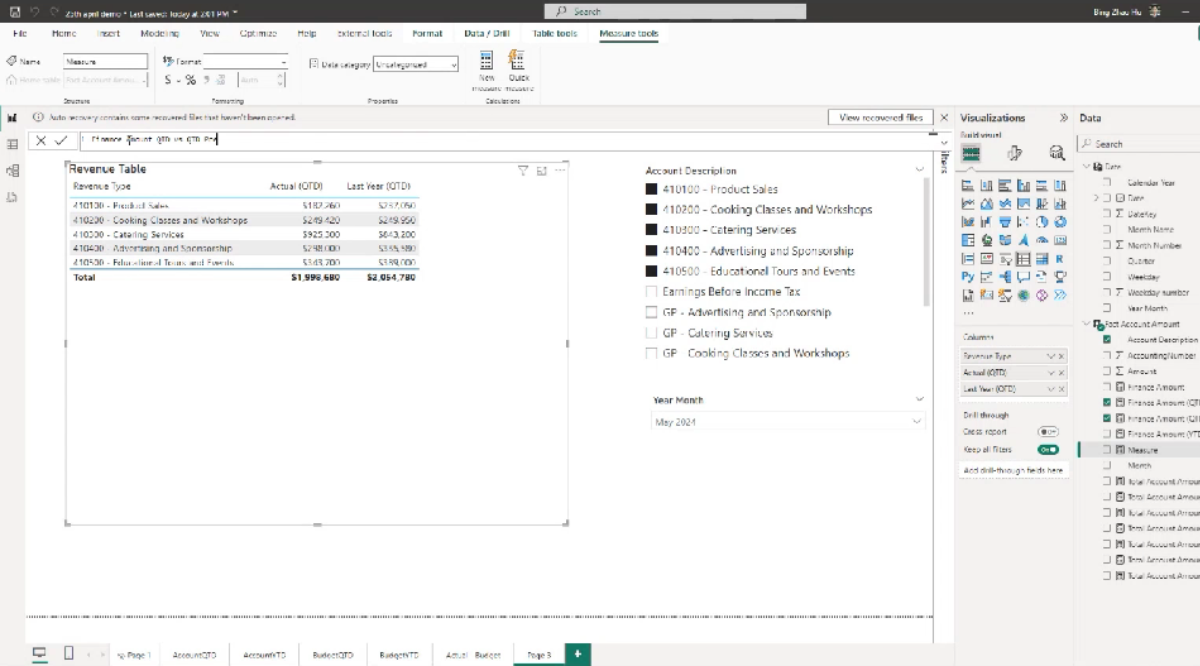
On 30 November 2023, AFON hosted a webinar 'Data Discovery Made Easy With Power BI' exclusive to our customers. Presented by our Analytics Manager, Ho Bing Zhao, the webinar covered how businesses can leverage Microsoft Power BI to achieve faster and smarter reporting on their financial data.
Here are some of the highlights of our webinar.
Inventory Summary Dashboard
Demo of Inventory Summary Dashboard
In the webinar, we covered how customers of Power BI can make use of the Inventory Summary Dashboard not just to get all of their business’s inventory data at their fingertips, but also filter the data down to find the exact information that they need.
We demonstrated how you could use Power BI’s interactivity to identify the prime movers amongst your inventory line items; that is, those which accounted for 80% of your sales over the past year. We also showed how you can filter out aging stock residing in each individual warehouse owned by your business, so that you’d know to clear out the old stock through promotions or discounts.
Last but not least, we also showed how you can use Power BI to find out which inventory line items have low turnover rates, and reference charts that display sales trends to identify the causes – such as a slowdown in sales, or an overstock of the item in the warehouse.
Inventory Stock Management Dashboard
Demo of Inventory Stock Management Dashboard
We demonstrated how you could make use of the Inventory Stock Management Dashboard to automate your re-stocking processes, with settings that automatically labelled inventory line items as having ‘LOW’ or ‘EXCESS’ stock when a pre-set threshold is reached. This ensures that your business would never lose sales due to stock-outs, or lock up cash in aging inventory due to excess inventory.
In addition, we showed how the interactivity of Power BI dashboards facilitates your stock management is through the embedded ‘quantity sold per month’ line chart in the dashboard. By right-clicking on a data point in the chart, and selecting options such as displaying data in table form, you can gain more precise insights on your inventory stock levels.
Sales Dashboard
Demo of Sales Dashboard
Last but not least, we covered how Power BI makes it easy for users like yourself to create daily sales dashboards which are tailored for the individual user. By making use of the Subscription feature, users of Power BI can filter reports to reflect only the data that each individual employee needs for their work, and then send them out via email.
While directors and C-level executives can get reports that provide a daily, up-to-date status update on their MTD and YTD sales, individual sales employees will receive reports that reflect sales data that directly reflect their performance. This means that generating reports through Power BI is much easier and more streamlined than manually creating reports for each individual.
Because Power BI comes with a mobile app, the end users in your business can also pull up their sales dashboard reports through their mobile devices, ensuring that the data they need are available to them on-the-go.
Get The Data You Need Most More Easily With Power BI
In this webinar, we covered how the interactive visualisations that Power BI generates can be leveraged as a useful tool to optimise and streamline your inventory and sales management.
These include ways to track and monitor the turnover of your inventory line items, whether any such items are at risk of stock-out or overstocks, and the sales performance of your business on an organisation-wide and individual employee performance basis more easily.
And these are just some of the simplest ways to leverage the interactive visualisations of Power BI. You can customise the reports it generate to better fit the unique needs of your business, but it may require expertise with the data visualisation software you may not have in-house.
At AFON IT, we can help you with that. To find out more about how we can help customise Power BI to your business requirements, do drop us a note here and our consultants will get back to you shortly. Alternatively, give us a call at +65 6323 0901.
Or, if you’d like to find out more about how Microsoft Power BI can transform your data into easily digestible and actionable insights for your business, click on the image below to download our free, all-in-one guide to Power BI today.


